sandwich_shop
Worksheet 2 — Stateless widgets
What you need to know beforehand
Ensure that you have already completed the following:
Getting help
To get support with this worksheet, join the Discord channel and ask your questions there. Otherwise, attend your timetabled session and ask a member of staff for help.
Getting started
For this worksheet, you can start with the code from branch 1 of our GitHub repository which should be similar to what you’d have at the end of worksheet 1. You can either clone the repository and checkout branch 1 by running the following in the terminal (skip to the checkout if you have already cloned our repository):
git clone https://github.com/manighahrmani/sandwich_shop.git
cd sandwich_shop
git checkout 1
Alternatively, you can continue with the Flutter project you created in Worksheet 1. This project should already be a repository in your GitHub account.
Set up the project
We will start to incrementally build the “Sandwich Counter” application.
Import the Material Design library
Open lib/main.dart and ensure that you have the correct import statement for Material Design components:
import 'package:flutter/material.dart';
Material Design is a design system from Google. The package:flutter/material.dart library gives you access to its pre-built User Interface (UI) components, called widgets. We will use these widgets to build our user interface.
Use Copilot to explore this library further. For example, you can ask it: “What kind of widgets are available in the material.dart library? List a few examples and explain them briefly.”
For completeness, below are some general categories of fundamental building blocks in Flutter:
- Structural elements like
Scaffold(for page layout),AppBar(for the top application bar), andDrawer(for navigation menus). - Buttons like
ElevatedButton,TextButton, andIconButton. - Informational widgets like
Text,Image, andIcon(for displaying icons). - Input widgets like
TextField(for text entry) andCheckbox(for boolean input). - Layout widgets like
Row,Column,Stack, andCardthat help you arrange other widgets.
Clean the default code
Locate the main() function in lib/main.dart, which is the entry point of your app. Let’s clear out the default MyApp class and other related classes from the app.
Comment out or remove this line for now. You can comment a line in VS Code by selecting it with your mouse and pressing Ctrl + / on Windows or ⌘ + / on macOS.
The (uncommented) code in your lib/main.dart file should now look like this:
import 'package:flutter/material.dart';

void main() {}
Commit your changes (1)
Now is a good time to commit your changes. In VS Code, go to the Source Control panel. You can open this from View > Source Control. Alternatively, you can open the Command Palette by pressing Ctrl + Shift + P on Windows or ⌘ + Shift + P on macOS and enter Source Control, which will open the Source Control panel.
You should see main.dart listed under changes. Type a descriptive commit message, such as Set Up the Project, and click the Commit button, followed by Sync Changes.
Alternatively, open the terminal using Ctrl + ` on Windows or ⌘ + ` on macOS and run these commands:
git add lib/main.dart
git commit -m "Set Up the Project"
git push
Define the main app widget: App
We will now define the main widget for our application.
Add the following class definition to lib/main.dart, below the main() function, on a new line after the closing curly brace (}):
class App extends StatelessWidget {
  const App({super.key});

  @override
  Widget build(BuildContext context) {
    return Container();
  }
}
This App class is a StatelessWidget, meaning its state and properties can’t change once it’s built. All widgets must have a build method, which describes the widget’s part of the user interface.
For now, it returns an empty Container, which is like a blank div in HTML. To understand this code better, select the entire class and ask Copilot by pressing Ctrl + I on Windows or ⌘ + I on macOS: “Explain what this StatelessWidget does, line by line. What is build and why do we need it? What does the override do? What about the super.key?”
Use the App widget
Next, update the main() function to run our new App widget:
void main() {
  runApp(const App());
}
The runApp() function takes our App widget and makes it the root of the widget tree, displaying it on the screen. If you run the app now, you will just see a blank screen.
Commit your changes (2)
Commit your work with a meaningful message, such as Define the Main App Widget: App.
Define the UI inside App
Let’s give our App widget some structure and content.
Redefine the build method
Modify the build method within the App class as follows:
@override
Widget build(BuildContext context) {
  return MaterialApp(
    title: 'Sandwich Shop App',
    home: Scaffold(
      appBar: AppBar(title: const Text('Sandwich Counter')),
      body: const Center(
        child: Text('Welcome to the Sandwich Shop!'),
      ),
    ),
  );
}
Here, we’ve created a “widget tree”. MaterialApp is the root (parent), providing core app functionality. Scaffold provides the basic screen layout, including an AppBar (the top bar) and a body. The body contains a Center widget, which in turn holds our Text widget.
As before, for a deeper understanding of this structure, use Copilot to explain each widget’s role.
Run the application
Make sure you have a device selected (e.g., Chrome or Edge from the bottom status bar). You can also open the Command Palette by pressing Ctrl + Shift + P on Windows or ⌘ + Shift + P on macOS and type “Flutter: Select Device” to choose a device.
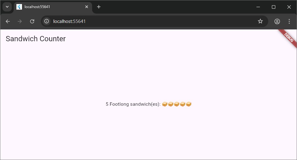
With a device selected run the app by pressing F5. You should see an application with an app bar titled “Sandwich Counter” and “Welcome to the Sandwich Shop!” centred on the screen.

Commit your changes (3)
Commit your work with a message like Define the UI inside App.
Create the custom OrderItemDisplay widget
You can create your own reusable widgets by combining existing ones. We will create a custom widget to display a single sandwich order.
Define the OrderItemDisplay widget
Add the definition for OrderItemDisplay in lib/main.dart, placing it below the App class:
class OrderItemDisplay extends StatelessWidget {
  final String itemType;
  final int quantity;

  const OrderItemDisplay(this.quantity, this.itemType, {super.key});

  @override
  Widget build(BuildContext context) {
    return Text('This is a placeholder for OrderItemDisplay');
  }
}
You may need to auto-fix any warnings by hovering over the squiggly lines and clicking on the lightbulb icon or pressing Ctrl + . on Windows or ⌘ + . on macOS.
This StatelessWidget has two final instance variables, itemType and quantity, which are set by its constructor. final means they cannot be changed after the widget is created.
Running the app at this stage won’t show any visual changes yet, as we haven’t actually used the OrderItemDisplay widget in our App.
Commit your changes (4)
Commit your new widget with the message Define OrderItemDisplay custom widget.
Implement the build method of OrderItemDisplay
Now, let’s update the build method of OrderItemDisplay to show the sandwich type and quantity with emojis. We want it to display something like: “5 Footlong sandwich(es): 🥪🥪🥪🥪🥪”.
Update the build method inside your OrderItemDisplay so it looks like this:
@override
Widget build(BuildContext context) {
  return Text('$quantity $itemType sandwich(es): ${'🥪' * quantity}');
}
Commit your changes (5)
Commit this update with a message like Implement dynamic text in OrderItemDisplay.
Use OrderItemDisplay in App
Now we can use our new custom widget inside the main App.
Replace the placeholder in App
Find the build method of the App class and locate the Center widget within the Scaffold’s body. Then replace the placeholder Text widget in the body of the Scaffold with an instance of our new OrderItemDisplay widget as shown below:
@override
Widget build(BuildContext context) {
  return MaterialApp(
    title: 'Sandwich Shop App',
    home: Scaffold(
      appBar: AppBar(title: const Text('Sandwich Counter')),
      body: const Center(
        child: OrderItemDisplay(5, 'Footlong'),
      ),
    ),
  );
}
Run the application again
Run the app. You should now see “5 Footlong sandwich(es): 🥪🥪🥪🥪🥪” displayed in the centre of the screen.
Commit your changes (6)
Commit your final changes for this section with the message Use OrderItemDisplay in App.
At this stage, your code should look like our code as shown on the GitHub repository.
Exercises
Complete the exercises below and show your work to a member of staff present at your next practical for a sign-off. Your main guide for the rest of the exercises is the Flutter layout documentation. Remember to commit your changes after each exercise.
-
The
Flutter Inspectoris a tool for visualising the widget tree and debugging layout issues. Access it from the VS Code Command Palette (Ctrl + Shift + P or ⌘ + Shift + P) by typingFlutter: Open Flutter DevToolsand selecting the “Widget Inspector” option.Familiarise yourself with this tool by watching this YouTube video on the Widget Inspector and reviewing its official documentation. Use it to observe the relationship between the widgets in your app.
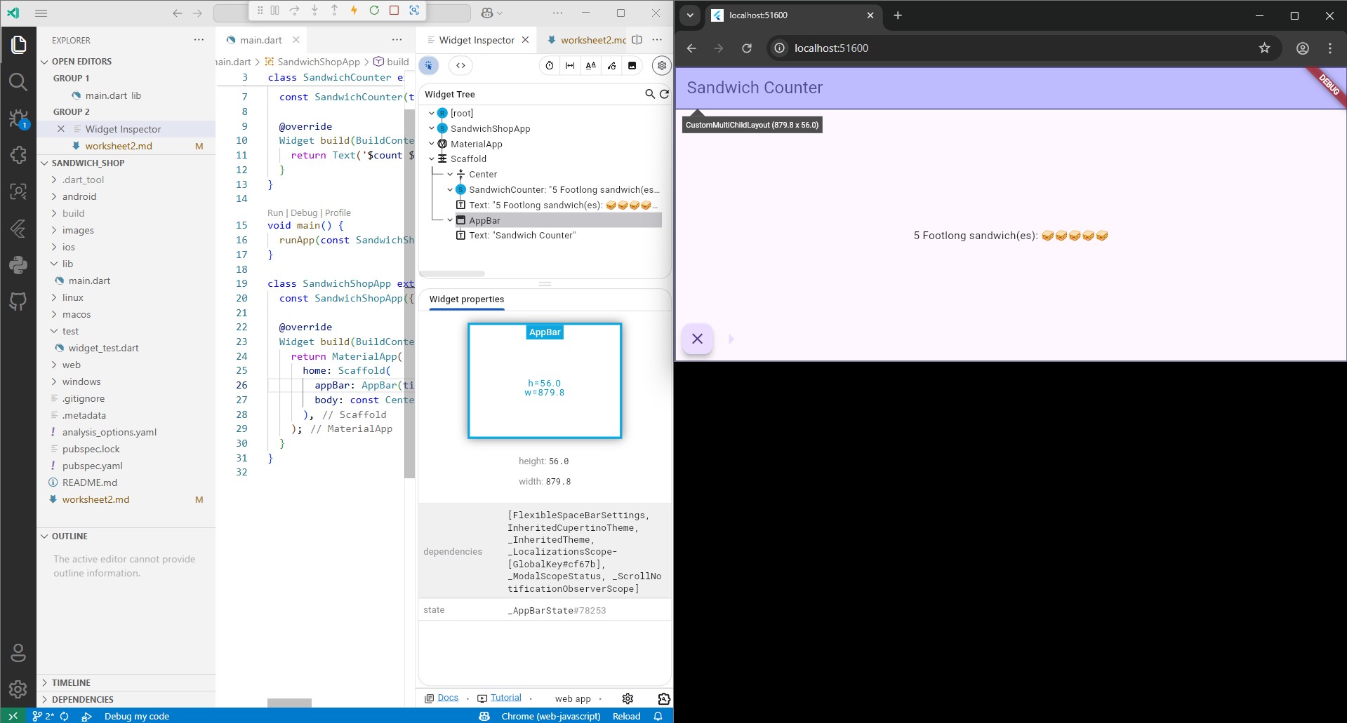
⚠️ Show your running app and the widget inspector to a member of staff for a sign-off. We need to make sure you can work your way around the widget inspector.
-
Wrap your
OrderItemDisplaywidget inside aContainerwidget. Use the documentation for the Container widget to learn how to use it.Give the
Containera fixedwidthandheightand acolor(e.g.,Colors.blue) to make it visible. See what happens when theOrderItemDisplay’s text is too big for theContainer.This is what it should look like:
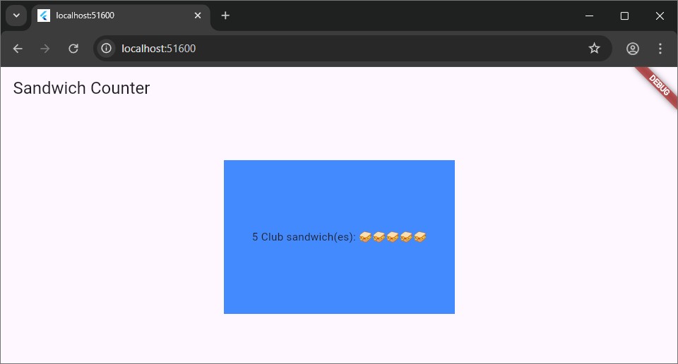
Update the
widthandheightproperties to see what happens if theOrderItemDisplay’s text is too big for theContainer.⚠️ Show your running app with the coloured container to a member of staff for a sign-off.
-
Read about layout widgets in the documentation pages.
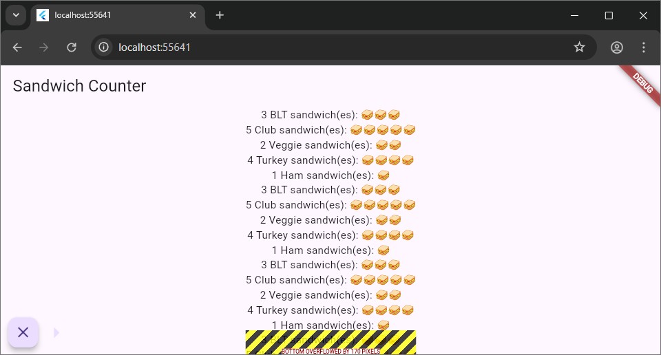
Your task is to use a
Columnor aRowto display threeOrderItemDisplaywidgets in instead of one in theContainerwhere the currentOrderItemDisplayis. Experiment with themainAxisAlignmentandcrossAxisAlignmentproperties to align them.The image below shows an example of a
Rowwith threeOrderItemDisplaywidgets. (Note that we have skipped the previous exercise, your implementation should still have the coloured container from the last exercise.)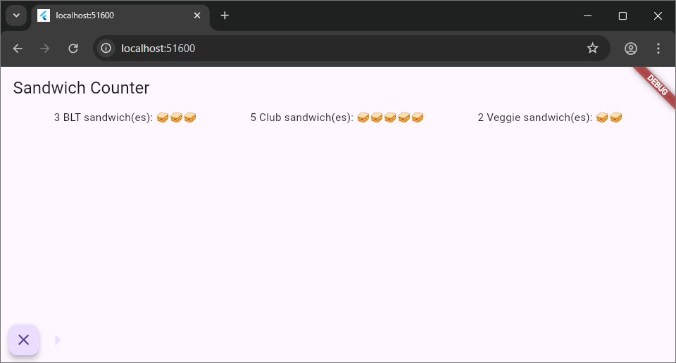
Resize the browser window. What happens if the
Rowis too wide for the screen? Use an LLM or the documentation to learn about layout “Constraints”.⚠️ Show your running app with the three widgets in a row or column to a member of staff for a sign-off.
-
We’ve already seen some of the Flutter styling options in the last worksheet. Go back to your
OrderItemDisplaywidget and apply a style to theTextwidget.Inside the
buildmethod ofOrderItemDisplay, use thestyleproperty of theTextwidget, which accepts aTextStyle. Use this to make the text green, bold and larger.At any moment, you can hover your mouse over the
TextStyleclass to see what properties it accepts. Once you have found the properties you want to change, write them inside theTextStyleconstructor (e.g.,TextStyle(property: value)).If you get stuck, try the shortcut Ctrl + Space on Windows or ⌘ + Space on macOS to see suggestions for properties you can use. Below, we have for example found out that
coloris a property ofTextStylethat accepts an instance of theColorclass. Try not to use an AI assistant to complete this task.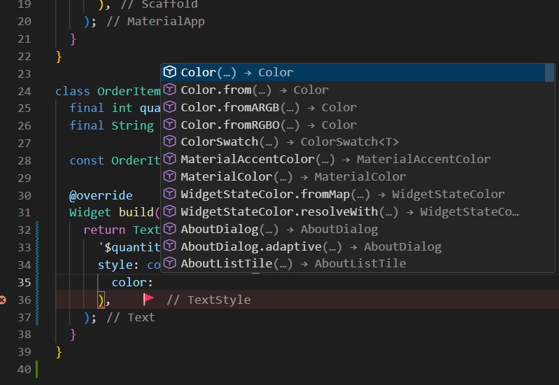
This task is optional and there’s no need to show it to a member of staff for a sign-off.
Refer to the official documentation on text and typography to learn more about external (Google) fonts.
-
(Advanced) Use a
Columnto display 20OrderItemDisplaywidgets this time. You will likely see an overflow error because the content is taller than the screen.To fix this, wrap the
Columnin aSingleChildScrollViewwidget, or replace theColumnwith aListViewwidget. Use the documentation for SingleChildScrollView and ListView to understand how they work.Refer to the debugging layout documentation if needed.
This task is optional and there’s no need to show it to a member of staff for a sign-off.
-
(Advanced) Read the documentation on creating adaptive layouts. Wrap your UI in a
LayoutBuilder. Inside itsbuilderfunction, check theconstraints.maxWidth.If the width is less than or equal to 600 pixels, display your
OrderItemDisplaywidgets in aColumn. Otherwise, display them in aRow. Observe the changes by resizing your browser window.This task is optional and there’s no need to show it to a member of staff for a sign-off.
-
(Advanced) You may have already thought about a way not to create a separate
OrderItemDisplayclass. This could equally be achieved by defining a helper method in theAppclass, like this:Widget _buildOrderItemDisplay(int quantity, String itemType) { return Text('$quantity $itemType sandwich(es): ${'🥪' * quantity}') }You would then call this method in the
bodyof theScaffoldof theAppwidget like this:body: const Center( child: _buildOrderItemDisplay(5, 'Footlong'), ),Watch this YouTube video to learn more about this approach and why it is not recommended albeit sounding like a simpler solution.
This task is optional and there’s no need to show it to a member of staff for a sign-off.